How to Photograph Artwork for an Appealing Look

At its core, photography captures light. When it comes to creating an appealing look, light is king. All the filters and modification work best when you get the light right from the outset.
If you’ve ever seen a real estate photographer at work, they start by bringing as much light into a space as they can. They raise blinds and turn on lights. They are looking show the brilliance of the colors and textures in a space. With a few exceptions, they rely on the light that comes naturally into a room.
When it comes to photographing your work, start with lighting that emphasizes the best aspects of your work. Whether you are using artificial light or indirect and reflected light, directing light from multiple directions often creates the best effect. Time spent on setup is never wasted. Even in this day of digital photography when you can try a thousand different angles and exposures, good setup for lighting will save you time and improve results.
Consider the different approaches to photographing paintings. If you work with vibrant colors, you will need plenty of light to keep them looking brilliant. Perhaps your work has distinctive brushstrokes. You can take additional pictures with a sharper side light that bring out the brushstrokes in your work.
If you create sculptures, you may need multiple directional light at varying strengths or distances to bring out the curves and shapes. When photographing 3D objects, try setting up a large softbox above the object. Then add a second, smaller softbox or reflection umbrella at an angle horizontal to the object – anywhere from 60 to 30 degrees forward of the side of the object.
Getting the color right is simpler than you might think. Place a white and black card in one of your photos. Use the card as a reference to set a white point and black point for your photos. You can then use the various filters in Adobe Lightroom or your favorite image software to adjust the photo.
A consideration to make in post is the difference between the photos you intend to post digitally and photos you want to have printed. When converting your photos to CMYK for print, you can lose some of the vibrancy of color. Increasing saturation and brightness a little helps make the print look more like the digital version. Of course, these print adjustments you would make yourself are for things like brochures, catalogs, and sales sheets. If you are creating CMYK prints for sale, you would be well served by working with a production house that specializes in preparing art prints.
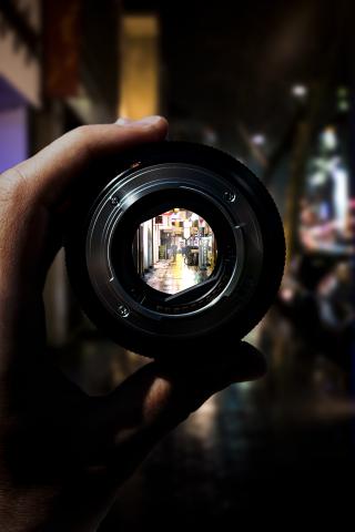
If you’re displaying art for sale, choose a lens with an angle similar to the human eye. Rather than using a wide-angle lens or a telephoto lens, use a lens at about 50mm. On a phone, this is the standard lens (1.0) that other lenses reference.
An additional concern is the choice of background and framing. For work being displayed for sale, choose neutral backgrounds and frames that don’t distract from the work. The idea is to help people see how your work will look in there space.
And don’t forget, above all, consider light.
